Select Works
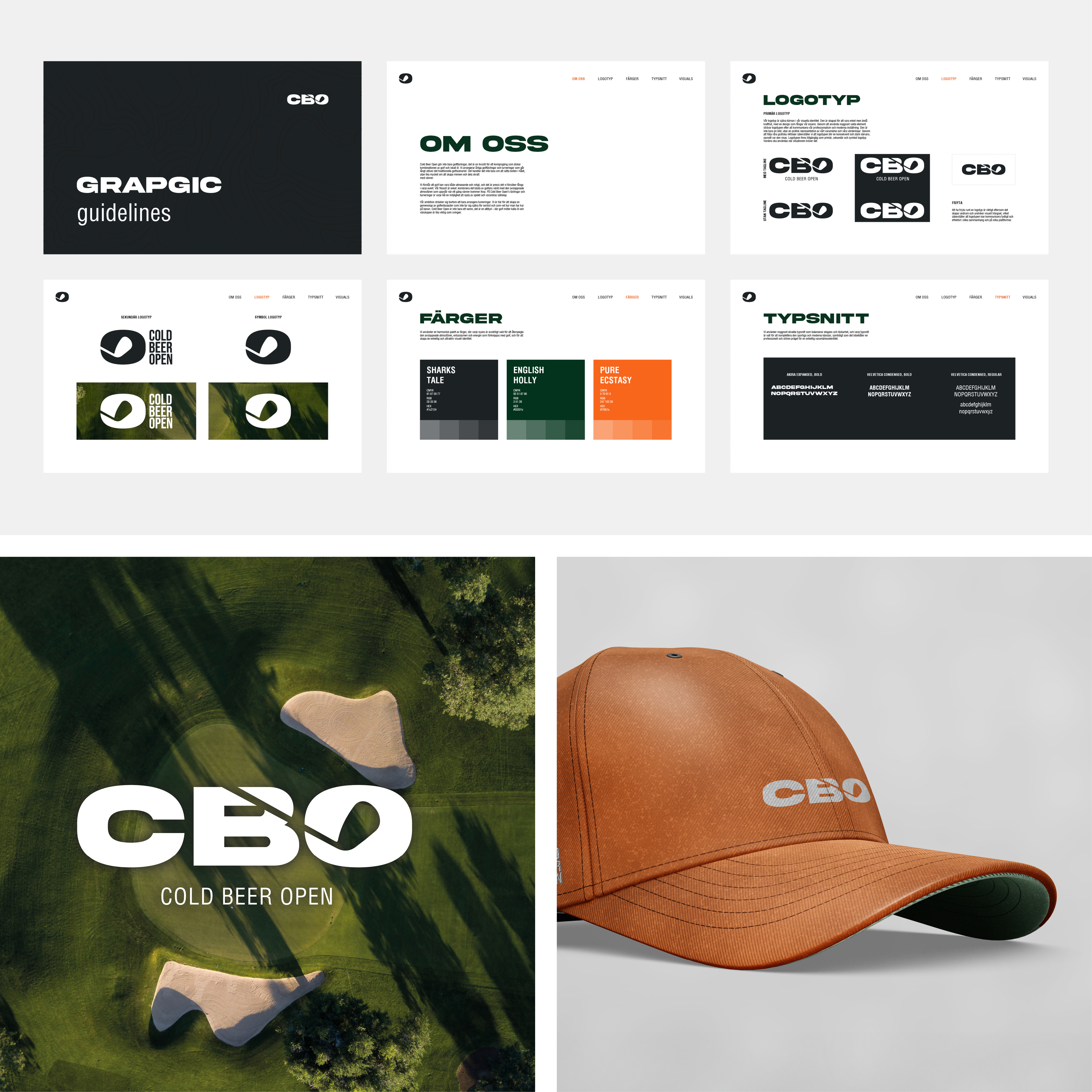
Cold Beer Open
For Cold Beer Open, we developed a cohesive identity that encapsulates its fun, laid-back lifestyle centred around golf and ice-cold beer. From the logo to product design, the goal was to reflect the brand’s emphasis on friendship and enjoyment, blending the casual atmosphere of the tournaments with a playful, yet bold visual style. The branding extends across all touchpoints, incorporating vibrant colours and relaxed typography that capture the spirit of camaraderie. Whether it’s the labels, social media content, or apparel, the design reinforces Cold Beer Open’s unique blend of golf, laughter, and good times, making it more than just a tournament—it’s a community-driven celebration of the game and the friendships that come with it.

Haru Gin
For HARU, a premium Japanese gin, we crafted a cohesive, striking brand identity reflecting its cultural heritage and craftsmanship. From logo design to packaging, every element tells a unified story.
The logo blends traditional and modern Japanese aesthetics, balancing minimalism with elegance. This extends to packaging, featuring a refined color palette, delicate illustrations, and premium textures that evoke luxury and authenticity. The bottle, label, and box merge sleek design with cultural nods, ensuring HARU stands out while honoring its origins.
The result is a visually compelling brand that offers more than gin—it’s an experience of heritage, quality, and elegance.
This is a fictional company.

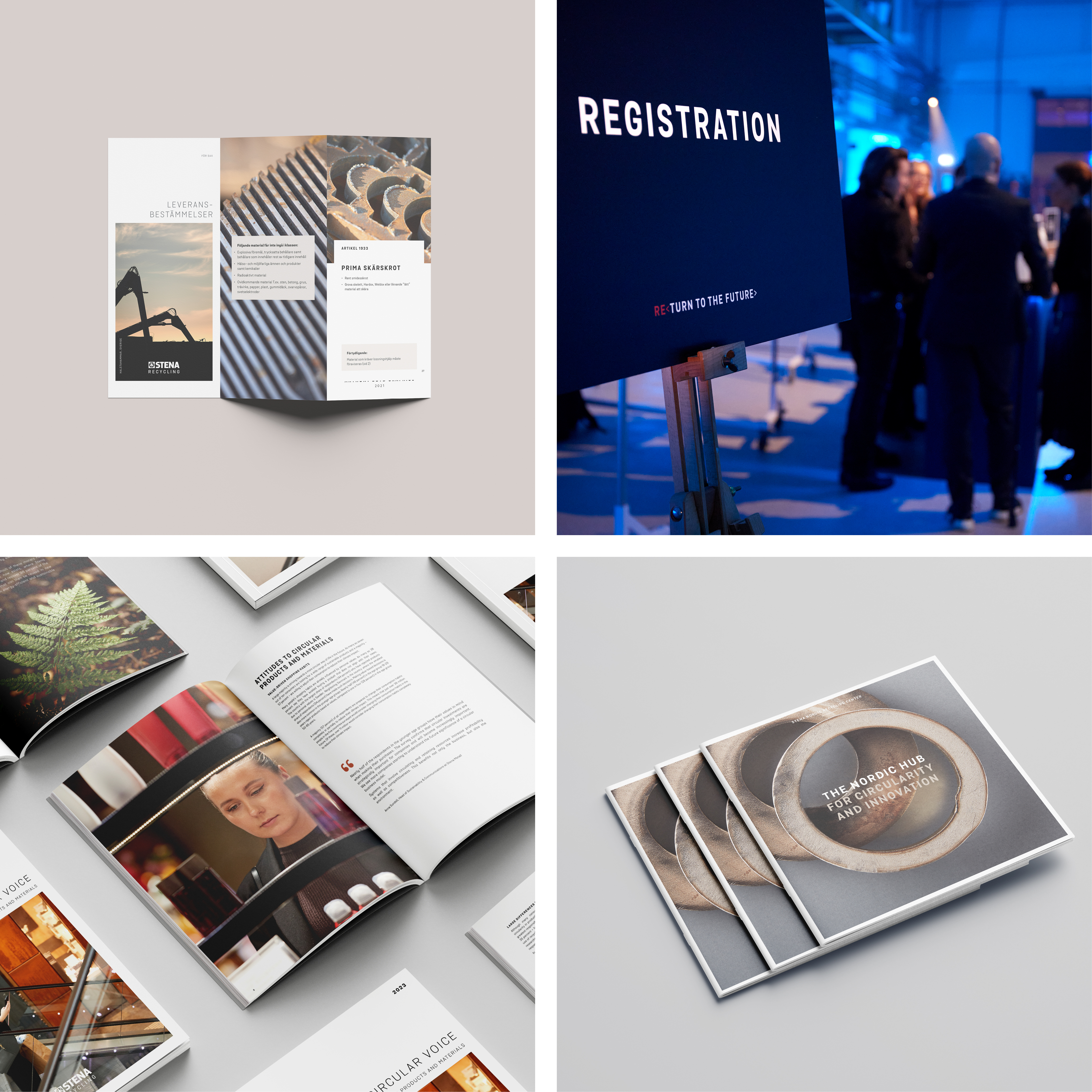
Stena
During my time at Stena, I had the chance to dive into a diverse range of projects that have been nothing short of an enriching rollercoaster. From crafting timeless print materials to orchestrating grand-scale events, I’ve navigated the realms of static digital content and dabbled in the art of video editing.
Seamlessly weaving through website production and graphic production, I’ve collaborated with a dynamic mix of internal and external partners, all while dancing to the tune of various stakeholders. It’s been a whirlwind of learning, and something I will take with me to future endeavours.

Zest.
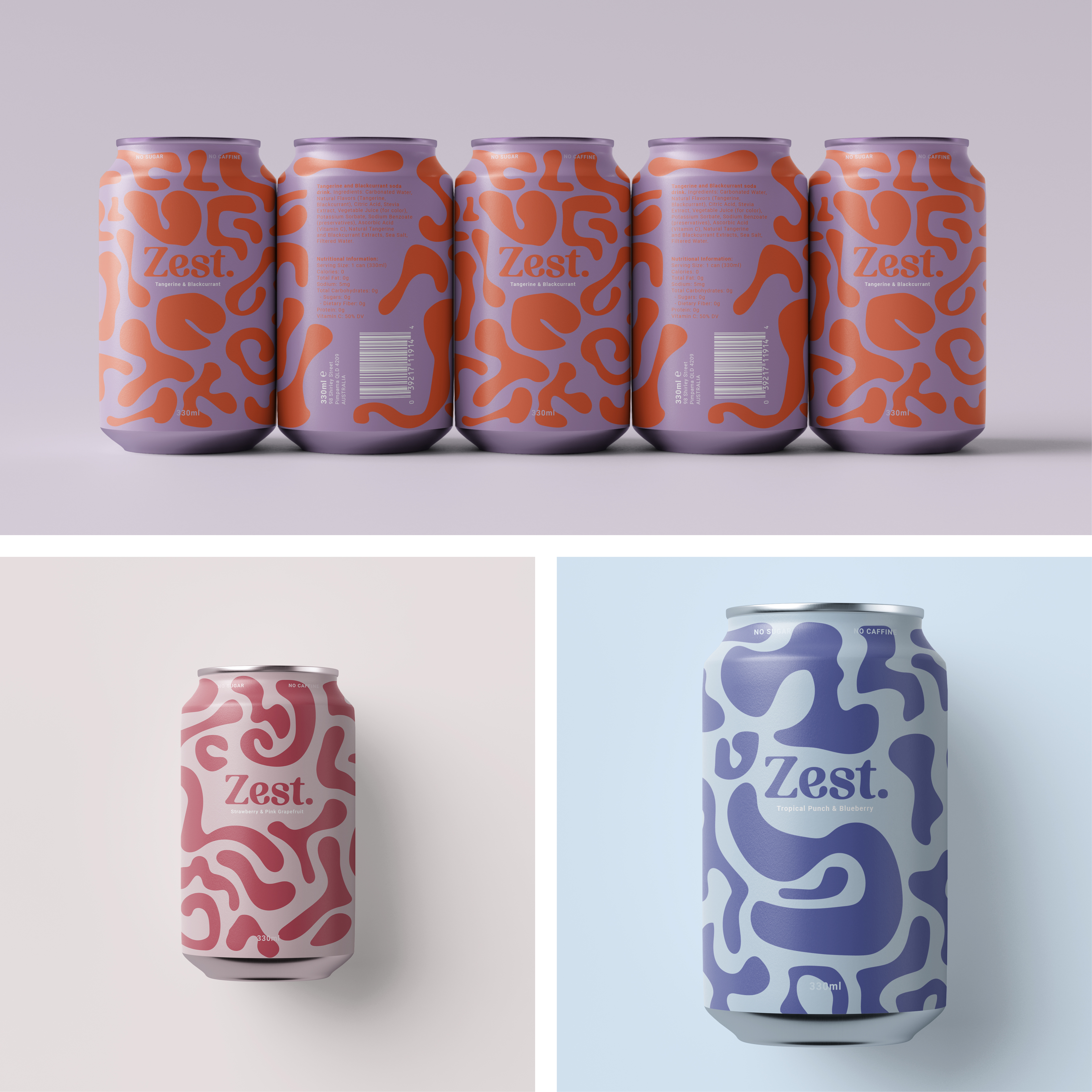
For Zest, we developed a brand identity that captures the vibrant, energetic essence of the company. From the bold logo to the dynamic product packaging, every detail reflects Zest’s mission to bring refreshing, adventurous flavours to life.
The branding is consistent across all touchpoints, with bright colours and lively designs that evoke the excitement of Zest’s sparkling sodas. Each bottle is crafted to feel like a celebration, embodying the fun and enthusiasm that define the brand. Zest isn’t just about soda – it’s about embracing a spirited lifestyle full of flavour and fizz.
This is a fictional company.

Hunting Birdies Invitational
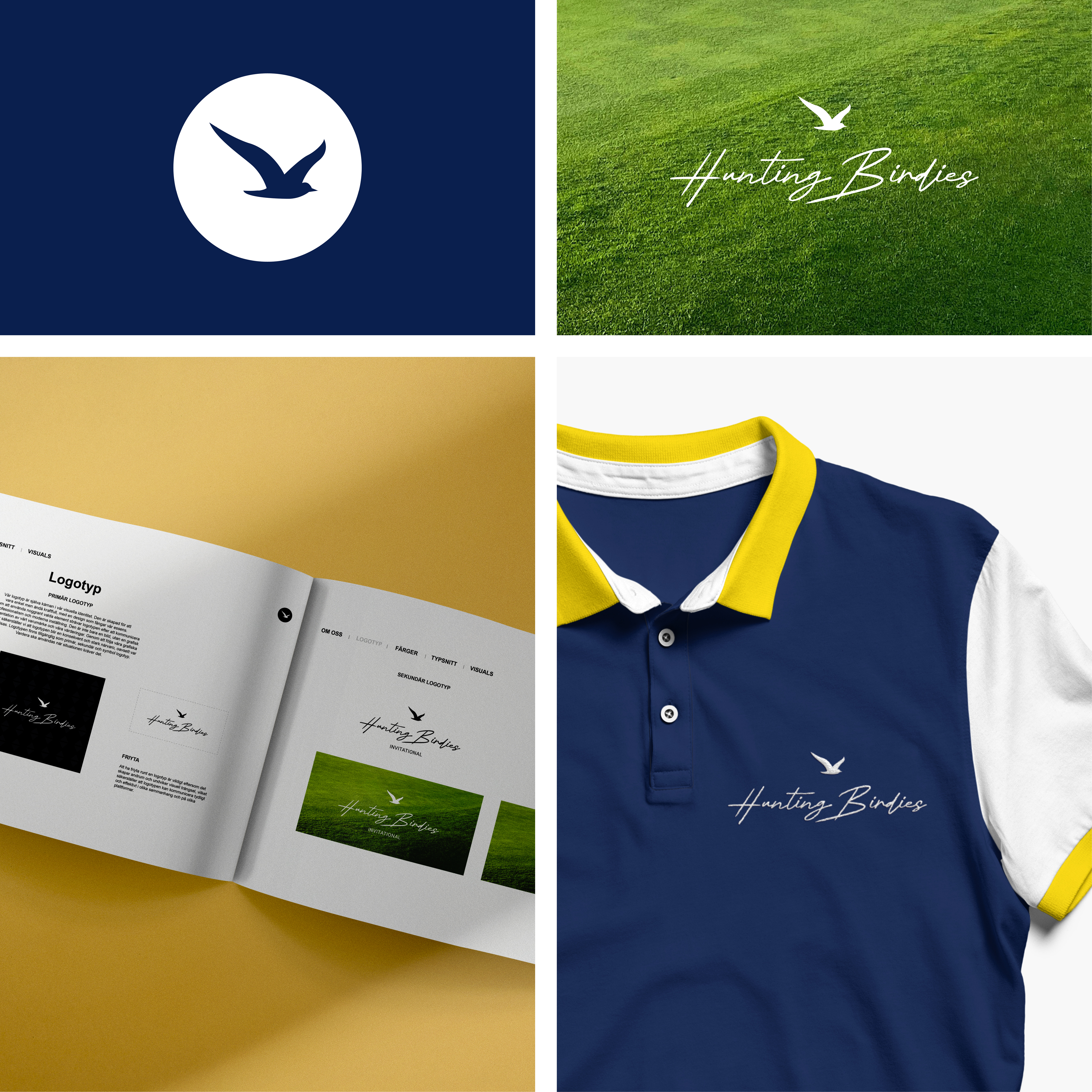
In this project, we crafted a unified identity that reflects the essence of friendship and the competitive, yet relaxed, spirit of the international golf event. From the logo to product design, the goal was to create a visual identity that captures the tournament’s blend of exclusivity and fun.
The branding extends across all materials, with refined typography and a balanced colour scheme conveying elegance and playfulness. Every design element enhances the experience, from social media to apparel, making Hunting Birdies Invitational more than just a golf tournament.
